
Unlocking Creativity: The Colour Wheel and Its Role in Interior Design

Unlocking Creativity: The Colour Wheel and Its Role in Interior Design
Colour, a fundamental element of our visual world, has the remarkable ability to shape our emotions, perceptions, and even our decisions. In the realm of interior design, harnessing the power of colour is an essential skill that can transform a space from mundane to mesmerising. At the heart of this skill lies the colour wheel—a tool that offers insights into colour relationships, harmonies, and contrasts. Here, we'll explore the concept of the colour wheel, its components, and how it can be effectively used in interior design to create stunning, balanced, and visually captivating living spaces.
Understanding the Colour Wheel
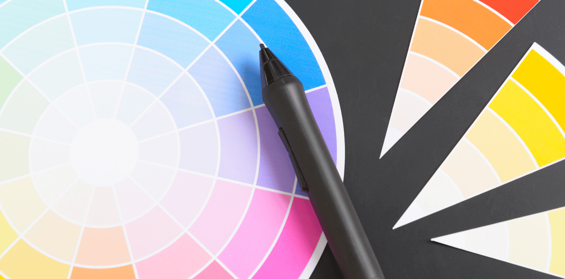
The colour wheel is a visual representation of the spectrum of colours, organised in a circular format to showcase their relationships and interactions.
It serves as a foundational tool for artists, designers, and anyone seeking to create aesthetically pleasing colour combinations. The colour wheel is divided into several key segments:
Primary Colours:
These are the building blocks of all colours and cannot be created by mixing other colours.
The primary colours are red, blue, and yellow. They form the basis for the entire colour spectrum.
Secondary Colours:
These colours result from mixing equal parts of two primary colours.
The secondary colours are green (blue + yellow), orange (red + yellow), and purple (red + blue).
Tertiary Colours:
Situated between primary and secondary colours, tertiary colours are achieved by mixing a primary colour with an adjacent secondary colour. For example, combining red with orange yields a red-orange hue.
Complementary Colours:
Complementary colours are located directly opposite each other on the colour wheel. These pairings create a dynamic contrast that makes each colour appear more vibrant when placed next to its complement.
Examples include red and green, blue and orange, and yellow and purple.
Analogous Colours:
Analogous colours are adjacent to each other on the colour wheel. They create a harmonious and soothing colour palette.
For instance, blue-green, green, and yellow-green are analogous colours.
Triadic Colours:
Triadic colour schemes involve selecting three colours that are evenly spaced around the color wheel.
This creates a balanced and visually pleasing contrast.
An example is the combination of red, blue, and yellow.
Split-Complementary Colours:
In this scheme, a base colour is paired with the two colours adjacent to its complementary colour.
For instance, blue paired with yellow-orange and red-orange.

The Role of the Colour Wheel in Interior Design
The colour wheel is not just a tool; it's a guiding principle that informs the art of interior design. By understanding the relationships between colours, designers can create spaces that resonate with a particular mood, ambiance, or theme.
Here's how the colour wheel can be effectively used in interior design:
Choosing a Colour Scheme:
The colour wheel provides a plethora of options for choosing colour schemes. Designers can opt for monochromatic schemes that use variations of a single colour, complementary schemes for striking contrast, analogous schemes for harmony, or triadic schemes for balance. The colour wheel offers a roadmap to selecting colours that work cohesively together.
Setting the Mood:
Different colour schemes evoke different moods. Warm colours like reds, oranges, and yellows create a cozy and energetic atmosphere, while cool colours like blues and greens induce calmness and relaxation. By strategically selecting colours, designers can set the desired emotional tone for a room.
Creating Focal Points:
Complementary colours, situated opposite each other on the colour wheel, naturally draw attention. Designers can use this principle to create focal points within a room. An accent wall painted in a complementary colour, for example, becomes an eye-catching centerpiece.
Achieving Balance:
The colour wheel aids in achieving visual balance. Using analogous or split-complementary colour schemes ensures that the room feels harmonious without becoming monotonous. These schemes distribute colour evenly, preventing overwhelming or stark visual effects.
Enhancing Flow:
The colour wheel assists in maintaining a sense of flow and continuity throughout a home. By selecting a dominant colour and applying its variations in different rooms, designers create a cohesive connection between spaces.
Highlighting Architectural Features:
The colour wheel can be employed to emphasise architectural features. Painting moldings, trim, or window frames in contrasting or complementary colours makes these elements stand out, adding depth and character to the space.
Personalisation:
The colour wheel empowers homeowners to express their personal style.
By understanding colour harmonies and contrasts, you can customise your living spaces to reflect their preferences and individuality.
The colour wheel is more than a tool; it's a window into the world of colour relationships, harmonies, and contrasts. In the context of interior design, its significance cannot be overstated. By embracing the principles of the colour wheel, designers can create spaces that resonate with emotion, balance, and beauty. The colour wheel is a guide that transforms the abstract concept of colour into tangible and captivating living environments.
Whether you're seeking to infuse energy, evoke calm, or simply dazzle the senses, the colour wheel is your key to unlocking the vast potential of colour in interior design.